Web is becoming extremely competitive. Some websites outperform others with their functions, design, usability, content etc. However, interactive design and animations are certainly a win-win over and above all the factors that help websites in standing out remarkably.
Smart interaction and little animation can make a great deal of difference and add substance to your static websites. Here are a few transitions observed in User Experience Design by Monks:
- Animated Scrolling
Animated scrolling is gaining popularity. Especially more verbose websites having multiple links within content distract users and subconsciously users might skip to read piece of content and miss the context when the surf to the next page or paragraph. Animated Scrolling help them to directly go to a particular section when they click on the link or content or menu and then also bring them back to the main content after a certain interval of time.
Hope lies provide a menu button for mobile view, clicking on which it takes you on top of the page.
- Understandable toggle transitions
While you add transitions in the interface, make sure they are not sudden. Toggle menus with transitions help users in knowing the next thing that will happen after an action is completed. Also, with small detailed transitions you help make your website elements understandable to the end user.
Some of the sites effectively doing it includes Bootstrap, BBC News and Starbucks.
- Collapsed Forms
Most websites have a complete form to add a comment on the website blog or contact us page. Rather, having them collapsed and showing the most vital part of such form helps. Once the user clicks, expand the form and let them fill the rest of the required information. Keep it short and simple so that it doesn’t look deceiving either. For comments, pin the comment form to top and animate it on the click. This will also decrease the space it consumes uprightly on website helping it to look visually pleasing. The key to success is disclosing the fields in a progressive manner reduce UI components and reveal the features as and when users want them.
Very nicely done by New York Times Beta website as below:
- Easy refresh
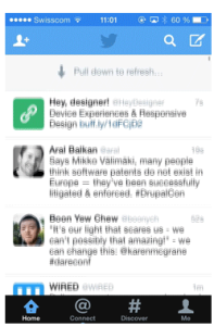
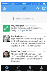
Refreshing an app or page has evolved immensely with the iPhone coming in the market. Pull to refresh technologies help users to refresh the page with simple scroll down rather than resorting to refresh button every time. With this invent, users have not to explicitly take an action and such a transition therefore helps in minimizing actions, efforts and at the same time adds an element of fun and interactivity.
- Affordance and Transitions
Having objects that doesn’t symbolize anything on website makes them static. Affordance is a kind of software that shows characteristics of the particular object and allows users to automatically get involved and take corrective steps to accomplish a task. Most websites and smartphones use ridges around accordance to enhance such transition to let people know that there is a manipulation possible with that button or menu. Ridges around affordance also help to point features in an interface.
Apart, the developers also use techniques like focus transition that animates and highlight important elements in an interface, Context based hiding that hides the content already consumed by visitors saving on the screen space and making it work with the flow, Sticky labels that add labels to the main content besides it and scrolls the same to emphasis and clearly showcase the valuable information alongside content. Let us know the kind of transition you offer on your websites through comments below:
(Source: Smashing Magazine)
Webby Monks
Latest posts by Webby Monks (see all)
- Usability Do’s and Don’ts for an Interactive Design - November 28, 2023
- Parallax Scrolling: It’s an angel in disguise that boosts web interactivity! - November 26, 2023
- Divine transitions in User Experience Design - November 16, 2023


