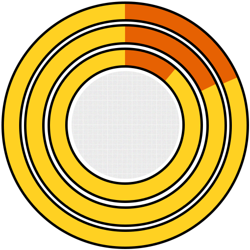
81.3% 18.7%
81.7% 18.3%
88.2% 11.8%
RWD share
in Top Tier Websites
RWD
Not RWD
Top 100
Top 1,000
Top 10,000
Google demands RESPONSIVE WEBSITES from 81% of websites!
Responsive web design (RWD) is an approach to web design that ensures the website renders correctly across the viewing environments (devices) with the use of fluid grids, images and CSS3 media queries. The purpose of developing responsive is easy reading and minimum resizing, panning, and scrolling.

Exploding mobile usage – 80% or more people use smartphones for internet searches.
There are more than 1.5 billion global mobile subscribers.
RWD provides a great experience to website visitors no matter the viewing environment.
Mobile research is becoming prominent for purchasing decision. 4 out of 5 consumers shop on smartphones.
Having one single URL makes it easier for Google bot to crawl your site.
According to Google’s Think Insights on Mobile, if a user lands on your mobile website and is frustrated or doesn’t see what they are looking for, there’s a 61% chance they will leave immediately and go to another website (most likely a competitor). It’s also said that if they have a positive experience with your mobile website a user is 67% more likely to buy a product or use a service.
RWD is officially a preferred design pattern for Google.
According to Com Score study, 55% of average social media consumption happens through smartphones.
81.3% 18.7%
81.7% 18.3%
88.2% 11.8%
RWD share
in Top Tier Websites
Top 100
Top 1,000
Top 10,000
Moreover, the survey also classifies that RWD uses fewer requests per page (74) compared to non-responsive sites (96).
The survey mentions that out of many top sites surveyed 62% neither delivered MDOT sites not responsive sites. Only 17%
catered to RWD and rest provided dynamic serving using MDOT sites.

So, if we go by the figures, the new mobile friendly algorithm of Google will surely have around 81% of non RWD under their lenses. And, if you do not timely change to RWD, chances are you fall prey to new algorithm. So what does the big daddy google demand with the new algorithm?


Inform Google when a page is formatted for mobile
Do not block the bots from crawling your page’s resources like CSS, images, etc.
Avoid mistakes like unplayable videos, bad links, etc as they provide
a poor experience resulting in demoted rankings.
 Loves Responsive design pattern?
A single URL for each page attracts higher links than if the same page was at multiple URLs. Similarly, if your mobile website sits at a different subdomain then the power of those links would be weakened.
Conceive of a scenario when your visitor wants to share your site and doesn’t move ahead seeing a different MDOT site as he isn’t sure devices other use for streaming sites. More visitors will love to share a site that’s flawless across the devices and adaptable to future bigger screens.
In addition to easier indexing, a responsive website has to be crawled less as a set of URLs need only be accessed once for the content.
Google takes two prominent factors into consideration: Time spent on site (less bounce rate) and quick repetitive search after leaving the page with not clicking again on the link if it appears on search results (an indication that the site is frustrating.)
Google's mobile ranking algorithm will officially include mobile-friendly usability factors and app indexing. Making sure your site is mobile-friendly is now more important than ever.
Not only this, users will find it easier to get relevant, high quality search results that are optimized for their devices.
This change will affect mobile searches in all languages worldwide and will have a significant impact in our search results.
More than penalty the update focuses on a ranking boost.
After the update, sites which will turn Responsive or mobile friendly will again benefit quickly in terms of the rankings unlike Penguin or Panda updates.
You could check about your page’s status if its mobile friendly using mobile-friendly testing tool of Google (Note – mobile friendly pages will be labeled mobile friendly)-
https://www.google.com/webmasters/tools/mobile-friendly/
It will begin to use information from indexed apps as a factor in ranking for signed-in users who have the app installed.
more than 60% sites are built using WordPress, it is critical to have Responsive WordPress site.
Find a responsive WordPress theme
Plugins can add quite a bit to your design and some of these will allow you to build layouts for
your site. Two examples are the OptimizePress plugin and WordPress Landing Pages.
Make sure you utilize professional coding agencies like WebbyMonks for
a clean and commended markup.
Make sure that the code is compatible across the browsers and touch devices.
If images are a problem, consider alternative CSS solution or use icon fonts.
So, want to do away with the new mobile friendly update and not get penalized? Come to us! WebbyMonks can
safeguard those non-responsive websites which otherwise might have been under the lens of Google’s update!


Webby Monks convert PSD to Responsive HTML and have robust expertise in developing mobile friendly WordPress sites. We are also good at using frameworks like Bootstrap and Foundation.
or email us on [email protected]
